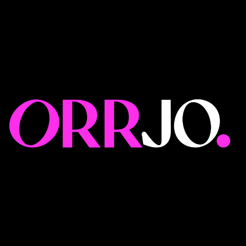
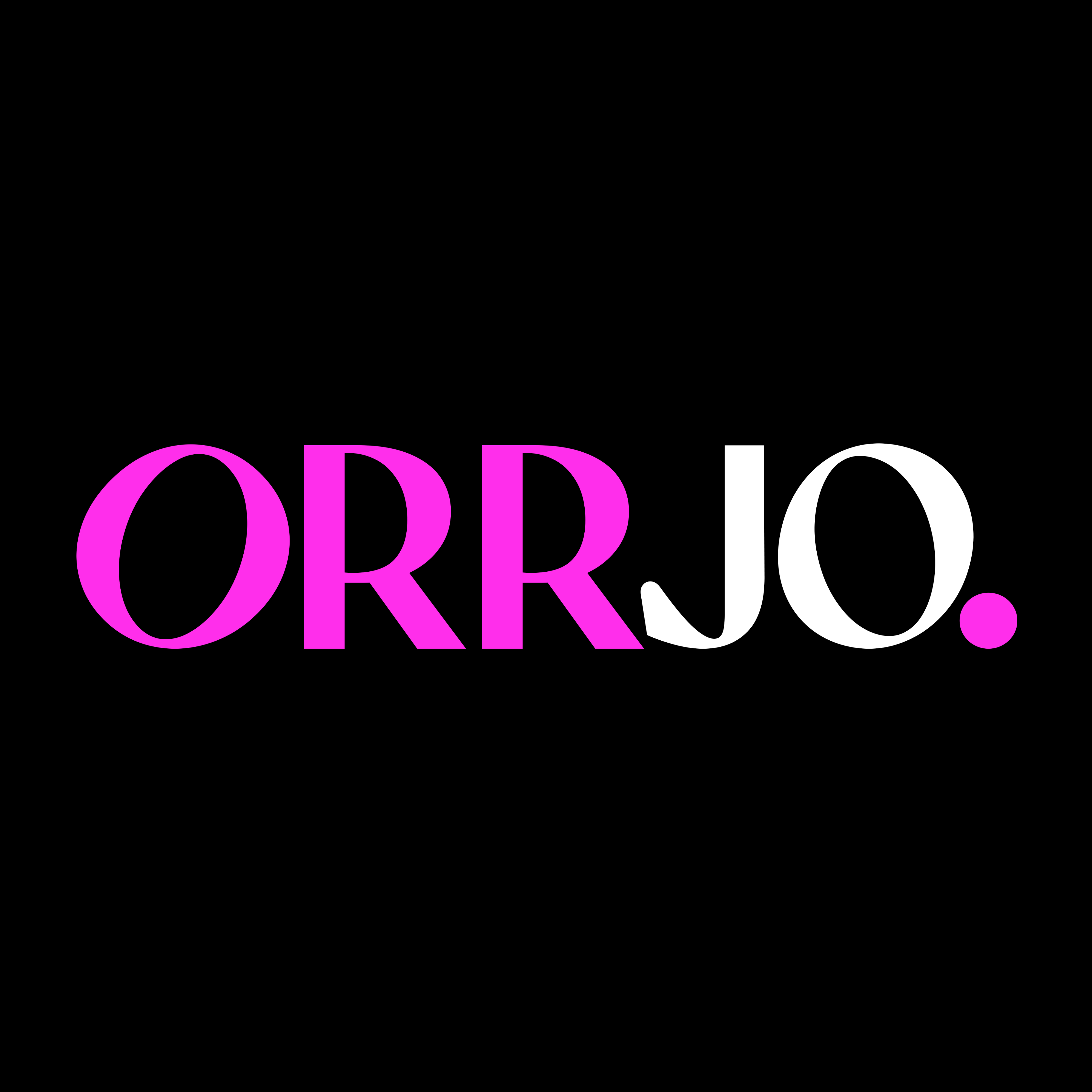
Brand Guidelines

The definitive guide to how ORRJO looks, speaks, and feels. Everything your team needs to keep the brand consistent.

Colour Palette

Our palette is anchored by ORRJO Pink on a black and white foundation. Pink is used for CTAs, highlights, and brand accents. Never for large background fills on the website.

Brand Primary

ORRJO Pink
#ff2eeb · rgb(255, 46, 235)
Pink Light
#ff6ef2 · Hover state
Pink Glow
rgba(255, 46, 235, 0.15)

Core Neutrals

Black
#0A0A0A
Dark
#1A1A2E
Off White
#FAFAFA
White
#FFFFFF

Grey Scale

900
#1C1C1C
800
#2A2A2A
700
#3A3A3A
600
#555555
500
#777777
400
#999999
300
#CCCCCC
200
#E5E5E5
100
#F5F5F5

Gradient

linear-gradient(135deg, #ff2eeb, #ff6ef2) — Used for headline highlights and decorative accents

Typography

We use Almarena, a licensed typeface from MyFonts. Display Bold for headings. Regular for body text. System fonts as fallback.

Heading Font

Almarena Display

Weight: 700 Bold · .otf format

Body Font

Almarena Regular

Weight: 400 Regular · .otf format

Type Scale

Heading 1
clamp(3rem, 7vw, 5.5rem) · 700 · line-height 1.1 · letter-spacing -0.01em
Heading 2
clamp(2rem, 4vw, 3.5rem) · 700 · line-height 1.1 · letter-spacing -0.01em
Heading 3
clamp(1.5rem, 2.5vw, 2rem) · 700 · line-height 1.1 · letter-spacing -0.01em
Heading 4
clamp(1.2rem, 2vw, 1.5rem) · 700 · line-height 1.1 · letter-spacing -0.01em

Body Large — We help ambitious organisations scale faster with multi-channel demand engines.

1.2rem · 400 · line-height 1.7 · color gray-600

Body — We help ambitious organisations scale faster with multi-channel demand engines, outsourced lead generation, and world-class creative.

1.05rem · 400 · line-height 1.7 · color gray-600

Section Label

0.8rem · 700 · uppercase · letter-spacing 0.1em · color pink

Card Label

0.78rem · 700 · uppercase · letter-spacing 0.1em · color pink

Buttons

All buttons are pill-shaped (9999px radius), 700 weight, with a 2px upward lift on hover. Primary pink is for the single most important action on the page.

Standard Buttons

Large Buttons

On Dark Backgrounds

Button Specs

Default: padding 14px 32px · font-size 0.95rem · radius 9999px
Large: padding 18px 40px · font-size 1.05rem
Nav CTA: padding 10px 24px · font-size 0.88rem
Hover lift: translateY(-2px) · Nav CTA uses translateY(-1px)
Pink shadow: 0 8px 32px rgba(255, 46, 235, 0.2)

Spacing

We use an 8px base grid. Section padding scales down at breakpoints to keep rhythm consistent across devices.

8px
mt-1
16px
mt-2
24px
mt-3
32px
mt-4
48px
mt-5
64px
gap
120px
section

Container

Max Width: 1200px
Narrow: 800px
Side Padding: 24px
Section Padding: 120px → 80px (1024px) → 64px (768px)

Shadows

Shadows are subtle and used sparingly. Pink shadow is reserved for primary CTAs and featured elements only.

Small
0 1px 2px rgba(0,0,0,0.04)
Medium
0 4px 16px rgba(0,0,0,0.06)
Large
0 8px 32px rgba(0,0,0,0.08)
XL
0 16px 48px rgba(0,0,0,0.1)
Pink
0 8px 32px rgba(255,46,235,0.2)

Border Radius

Five radius tokens cover all components. Cards and images use 16px. Buttons and badges use full pill (9999px).

Small
8px
Medium
12px
Large
16px
XL
24px
Full
9999px

Iconography

We use inline SVG icons throughout. Consistent stroke weight of 2px, 24x24 viewbox, rounded linecaps. Pink colour on icon backgrounds.

Activity

Team

Star

Bolt

Shield

Chat

Clock

Book

Icon Container

Large (card icon): 56px × 56px · radius 12px · background rgba(255,46,235,0.15)
Medium (value icon): 48px × 48px · radius 12px · background rgba(255,46,235,0.15)
SVG Spec: stroke-width 2 · viewBox 0 0 24 24 · linecap round · linejoin round

Photography & Imagery

Photography should feel authentic, warm, and professional. Team shots default to greyscale and reveal colour on hover.

Image Treatment

  • • Border radius: 16px on all images
  • • Object fit: cover (no stretching)
  • • Service card images: 240px height
  • • Case study images: 200px height
  • • Team photos: 1:1 aspect ratio

Hover Effects

  • • Team photos: greyscale(100%) to greyscale(0%)
  • • Card images: scale(1.05) on hover
  • • Client logos: greyscale(100%) + opacity 0.6 → full colour
  • • All transitions: 0.5s cubic-bezier

Decorative Orbs

Pink gradient orbs are used as background decorations on hero and CTA sections. They add depth without distraction.

Shape: Circle (border-radius 50%)
Blur: 80px to 120px
Opacity: 0.08 to 0.3
Colour: var(--pink)
Size: 180px to 500px diameter
Interaction: pointer-events none (non-interactive)

Motion

Motion is purposeful and restrained. We use three timing tokens. Every animation serves a function, not decoration.

Fast
0.2s cubic-bezier(0.4, 0, 0.2, 1)

Buttons, links, toggles

Medium
0.3s cubic-bezier(0.4, 0, 0.2, 1)

Cards, modals, nav

Slow
0.5s cubic-bezier(0.4, 0, 0.2, 1)

Image reveals, page transitions

Interaction Patterns

Hover lift: translateY(-2px) on buttons, translateY(-4px) on cards
Scroll reveal: opacity 0 + translateY(24px) → opacity 1 + translateY(0) via IntersectionObserver
Nav underline: width 0 → width 100% on hover (2px pink line)
Image zoom: scale(1.05) on hover
Ghost arrow: translateX(4px) on hover
Hero: Static. No entrance animation. Content loads instantly.

Layout & Grid

Content lives inside a 1200px container. Grids collapse responsively. Three breakpoints handle all device sizes.

Grid System

2 Column: 1fr 1fr · gap 32px
3 Column: repeat(3, 1fr) · gap 32px
4 Column: repeat(4, 1fr) · gap 24px
Split: 1fr 1fr · gap 64px · vertically centred
Team Grid: repeat(5, 1fr) · gap 28px 24px

Responsive Breakpoints

1024px
Tablet Landscape

3-col → 2-col
Section pad → 80px

768px
Tablet Portrait

All grids → 1-col
Mobile nav activates

480px
Mobile

Buttons go full-width
Team grid → 2-col

Navigation

Height: 72px fixed
Position: Fixed top, z-index 1000
Background: rgba(255, 255, 255, 0.92) with 20px blur backdrop
Border: 1px solid rgba(0,0,0,0.06)
Link size: 0.9rem · 400 weight · color gray-600
Link gap: 36px

Voice & Tone

ORRJO speaks like a sharp, experienced peer. Not a corporate vendor. Not a hype machine. Direct, data-backed, and genuinely helpful.

Confident, Not Arrogant
"10,000+ qualified meetings booked. Over £250M in pipeline generated."
Direct, Not Blunt
"We don't just generate leads. We deliver qualified meetings with decision-makers who are ready to talk business."
Approachable, Not Casual
"Let's build a growth engine tailored to your business."
Results Focused, Not Feature Focused
"Your market won't buy what it doesn't know exists. We change that."

Writing Rules

  • • British English spelling (organisation, colour, prioritise)
  • • No dashes in visible text content
  • • Lead with outcomes, not features
  • • Use specific numbers where possible (10,000+ not "thousands")
  • • Short sentences. Short paragraphs. Respect the reader's time.
  • • CTAs are conversational: "Let's Talk" not "Contact Us"
  • • Section labels are uppercase, short (2 to 3 words max)
  • • Headlines use title case
  • • Body copy uses sentence case
  • • Avoid jargon unless the audience expects it
  • • "We" not "ORRJO" in body copy (save brand name for headings)

CTA Language

Let's Talk

Primary CTA

Learn More →

Exploration

View Case Studies →

Social proof

Get Started →

Activation

Start Free Audit →

Free tools

Explore ORRJO AI →

Product launch

Do & Don't

Quick reference for common brand decisions.

Do
  • Use ORRJO Pink as an accent, not a background
  • Keep "ORR" pink and "JO" contextual in the logo
  • Use Almarena for all text (heading and body)
  • Use British English spelling throughout
  • Lead with outcomes and real numbers
  • Keep section labels uppercase and short
  • Maintain 16px radius on all cards and images
  • Use pill-shaped buttons for all CTAs
  • Use greyscale team photos that reveal on hover
  • Keep shadows subtle (our lightest option first)
Don't
  • Use pink as a full section background
  • Change the logo colours or add effects to it
  • Use system fonts or alternative typefaces
  • Use American English (organize, color)
  • Use vague claims ("best in class", "world leading")
  • Use dashes in visible text content
  • Mix radius values on the same component
  • Use square or sharp-cornered buttons
  • Use colour-saturated team photos by default
  • Add animations to the hero section

Logo Misuse

Never
  • Rotate, skew, or distort the wordmark
  • Place on busy or low-contrast backgrounds
  • Add drop shadows, outlines, or gradients to the logo
  • Separate "ORR" from "JO" or rearrange the characters
  • Use the logo smaller than 24px in height
  • Crowd the logo with other elements (respect clear space)
Always
  • Use the SVG version for web (vector, crisp at any size)
  • Use the PNG version for documents and presentations
  • Ensure sufficient contrast on the background
  • Maintain the period (".") as part of the mark
  • Link the logo to the homepage on all pages

CSS Custom Properties

Copy-paste reference for all design tokens used across the ORRJO design system.

:root {
  /* Brand */
  --pink: #ff2eeb;
  --pink-light: #ff6ef2;
  --pink-glow: rgba(255, 46, 235, 0.15);
  --pink-subtle: rgba(255, 46, 235, 0.06);

  /* Neutrals */
  --black: #0A0A0A;
  --black-soft: #111111;
  --dark: #1A1A2E;
  --gray-900: #1C1C1C;
  --gray-800: #2A2A2A;
  --gray-700: #3A3A3A;
  --gray-600: #555555;
  --gray-500: #777777;
  --gray-400: #999999;
  --gray-300: #CCCCCC;
  --gray-200: #E5E5E5;
  --gray-100: #F5F5F5;
  --gray-50: #FAFAFA;
  --white: #FFFFFF;

  /* Typography */
  --font-heading: 'Almarena Display', 'Almarena', -apple-system, sans-serif;
  --font-body: 'Almarena', 'Almarena Display', -apple-system, sans-serif;

  /* Spacing */
  --section-pad: 120px;
  --container-max: 1200px;
  --container-narrow: 800px;

  /* Motion */
  --transition-fast: 0.2s cubic-bezier(0.4, 0, 0.2, 1);
  --transition-med: 0.3s cubic-bezier(0.4, 0, 0.2, 1);
  --transition-slow: 0.5s cubic-bezier(0.4, 0, 0.2, 1);

  /* Shadows */
  --shadow-sm: 0 1px 2px rgba(0,0,0,0.04);
  --shadow-md: 0 4px 16px rgba(0,0,0,0.06);
  --shadow-lg: 0 8px 32px rgba(0,0,0,0.08);
  --shadow-xl: 0 16px 48px rgba(0,0,0,0.1);
  --shadow-pink: 0 8px 32px rgba(255, 46, 235, 0.2);

  /* Radius */
  --radius-sm: 8px;
  --radius-md: 12px;
  --radius-lg: 16px;
  --radius-xl: 24px;
  --radius-full: 9999px;
}

Questions about the brand?

Reach out to the creative team for clarification on any guidelines.

hello@orrjo.com